
Datalexing
UX Research
REDESIGN
Personalization
Data Visualization
Mobile Optimization
[ About the project ]
Saudi-origin work operating system
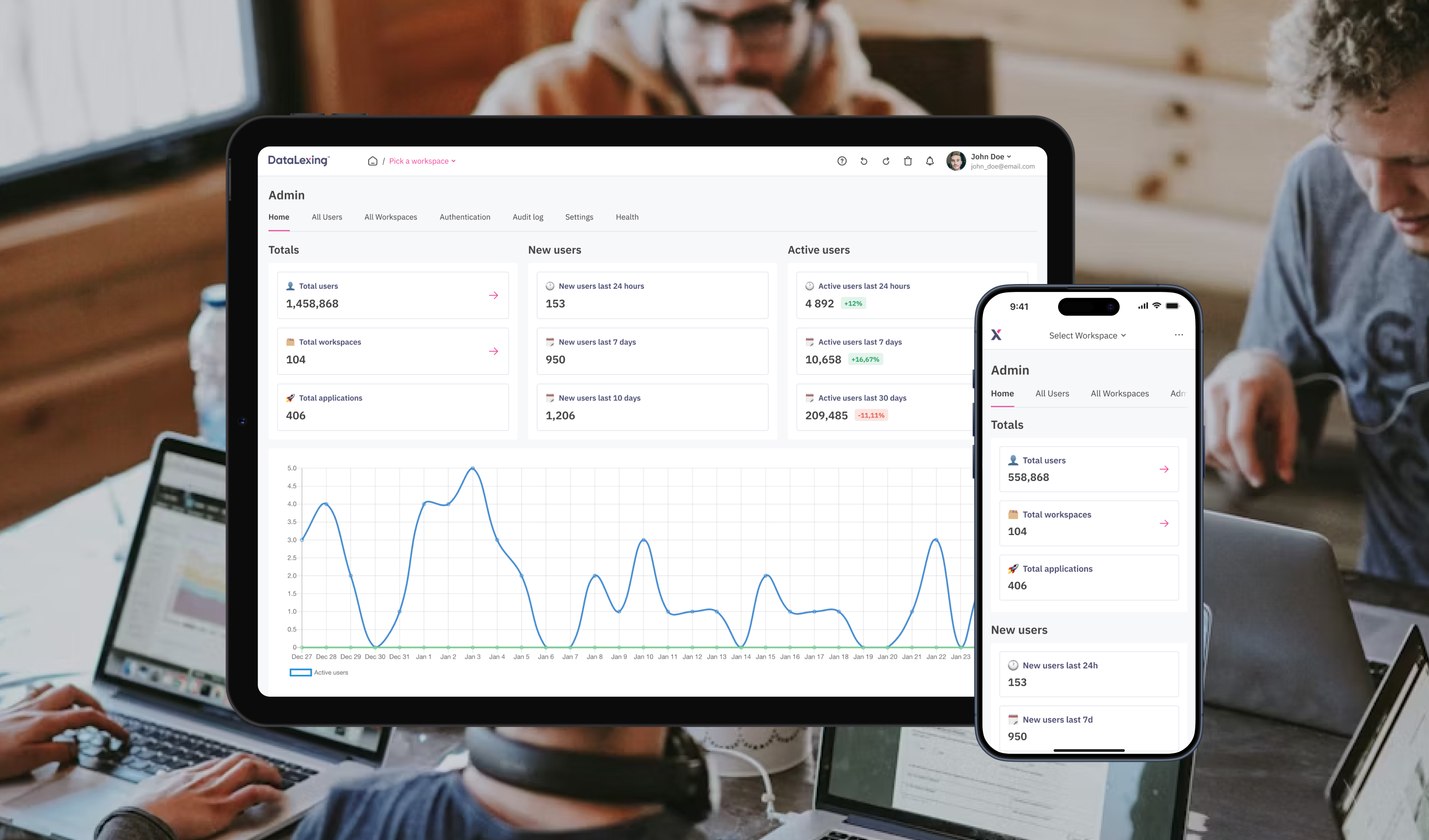
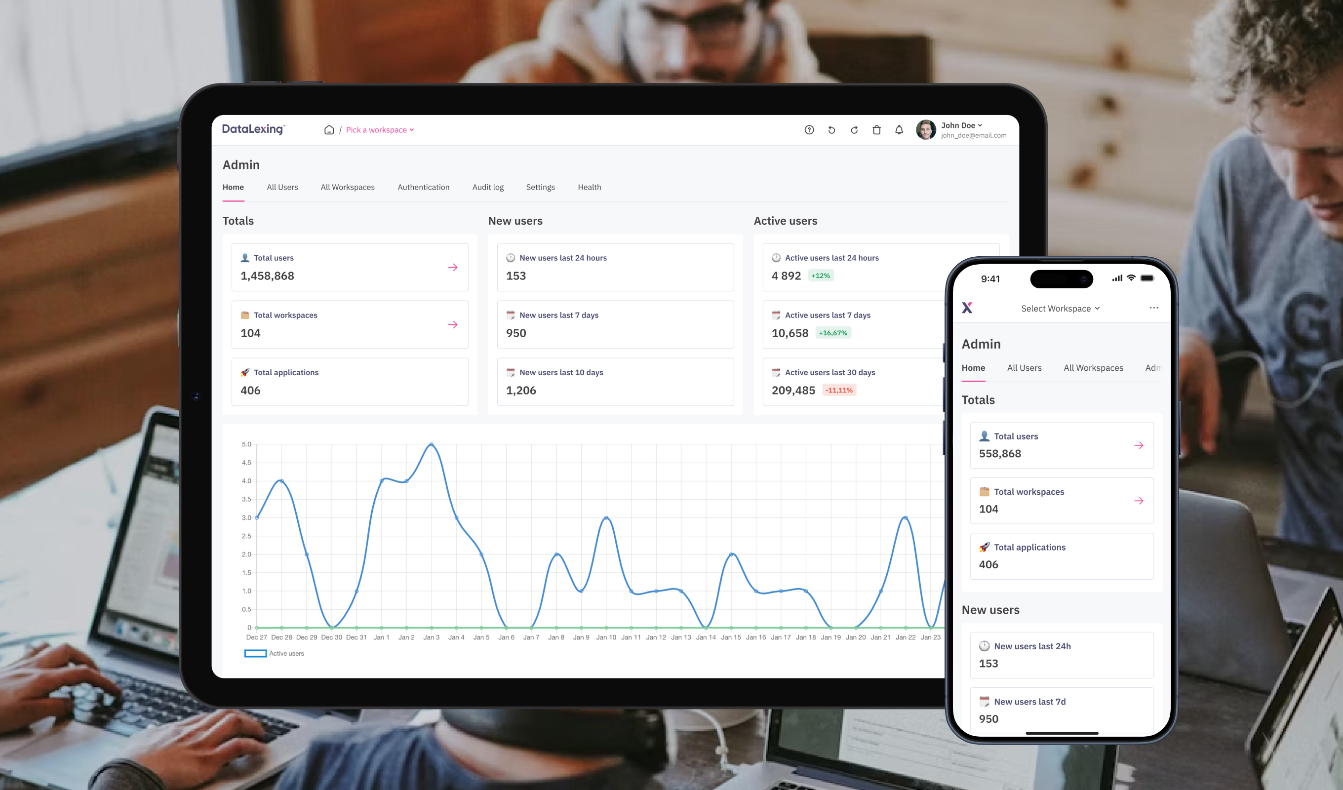
DataLexing centralizes project management, data, and workflows into one intelligent platform. The platform is trusted by government and enterprise teams across 40+ countries and emphasizes high security, compliance, and seamless cross-team communication
[ Challenge ]
Work OS redesign
Redesign an existing platform to create an intuitive, seamless experience that consolidates project boards, data sheets, reports, and automation into one unified system, reducing complexity, supporting both technical and non-technical users, and meeting enterprise-level security and compliance standards
[ Challenge ]
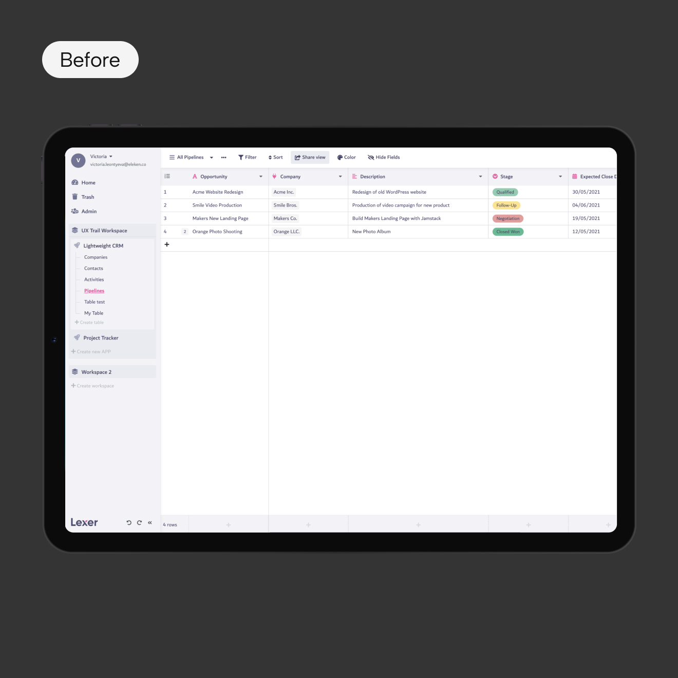
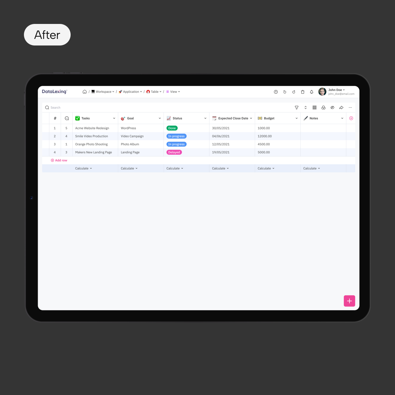
Usability and design issues
Users found the platform difficult to navigate, it was visually inconsistent, and not aligned with modern design standards. Additionally, the platform required new features and better mobile responsiveness
[ Task ]
Enhance user experience
Redesign the product to improve usability, modernize the interface, introduce new features, and create a consistent cross-platform experience
[ Actions ]
Design and experience improvements
- Reworked information architecture to simplify navigation
- Updated components for a unified design system
- Improved interaction patterns for clarity and consistency
- Optimized layouts for mobile responsiveness
- Added new features
[ Result ]
Enhanced usability
- Improved usability and navigation clarity
- Delivered a scalable foundation for future features growth
[ Challenge ]
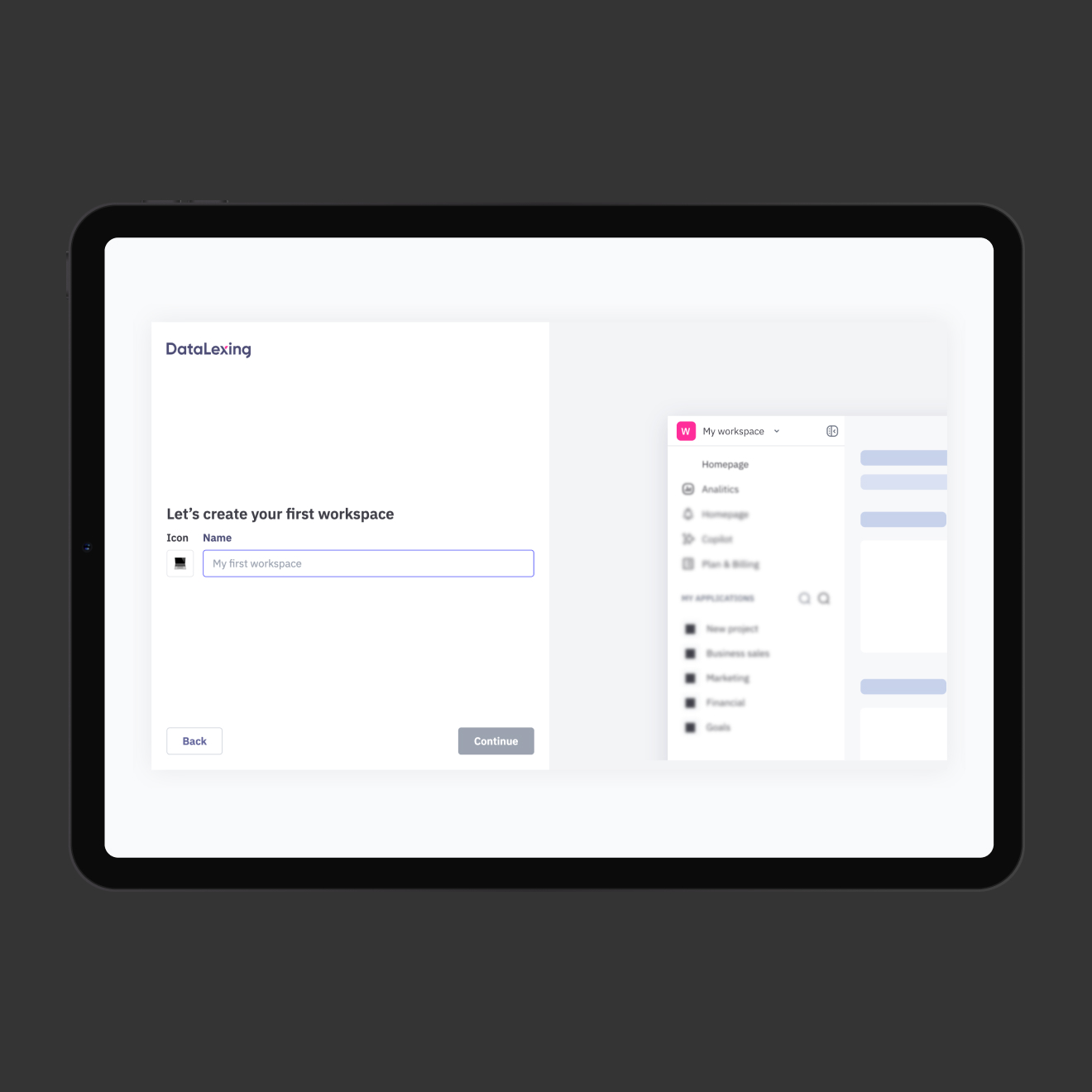
New users had difficulty getting started
The product lacked guidance, and users often abandoned key workflows early
[ Task ]
Design an onboarding experience
Design an onboarding experience that reduces friction, accelerates learning, and helps users quickly understand the platform’s value.
[ Actions ]
Added tutorials and in-app guidance
- Designed an interactive step-by-step tutorial
- Provided contextual guidance inside the interface
[ Result ]
Reduced confusion during first interaction
Faster user ‘aha moment’ discovery
[ Challenge ]
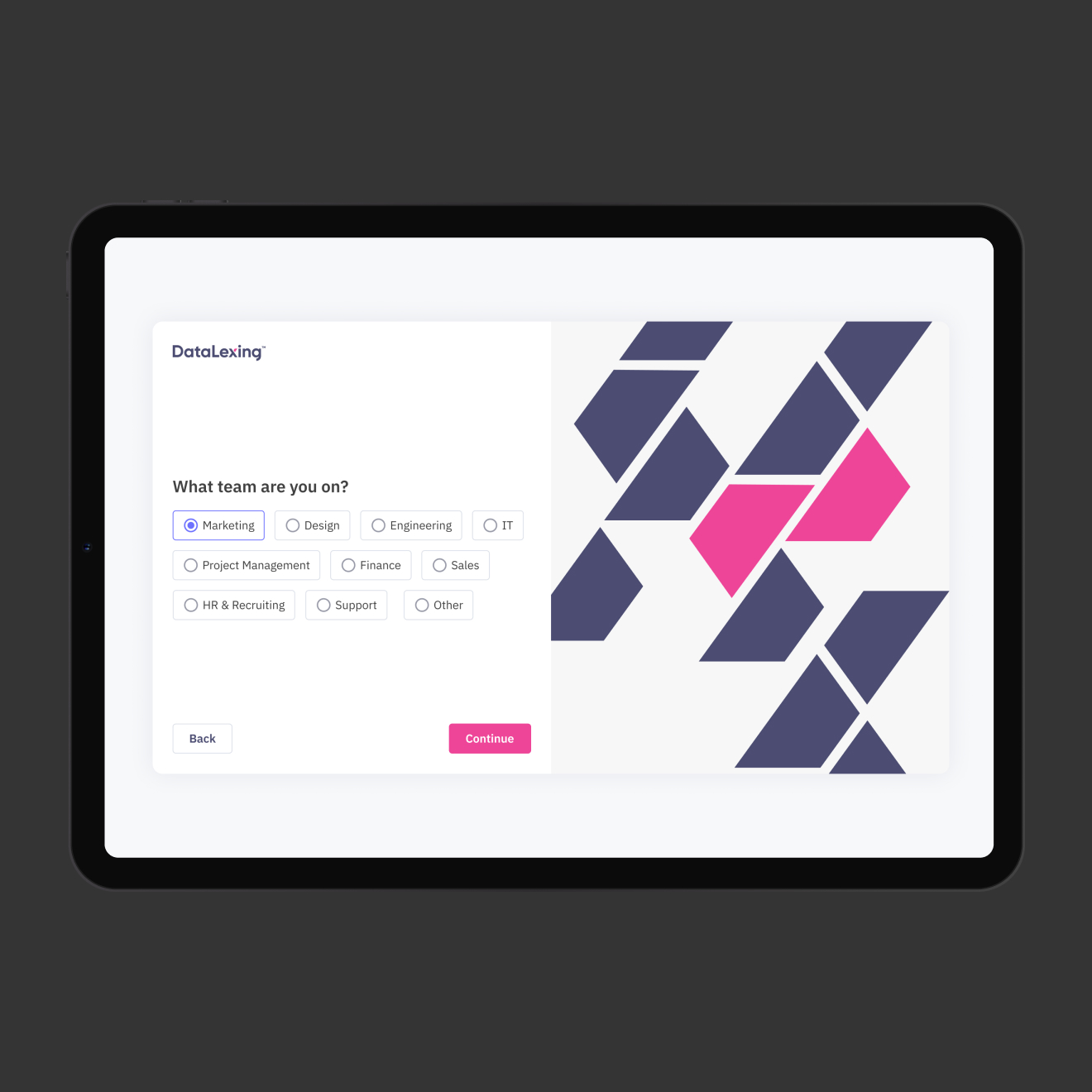
Lack of personalization
Users received the same generic experience regardless of their goals or interests, which reduced engagement and relevance
[ Task ]
Create a personalized experience
Create a personalized experience that adapts to user needs from the start
[ Actions ]
Onboarding questions and templates
- Introduced onboarding questions to identify user preferences
- Generated pre-made templates tailored to user goals
[ Result ]
Improved experience and engagement
- Increased relevance of initial experience
- Reduced setup time
- Improved user engagement
[ Challenge ]
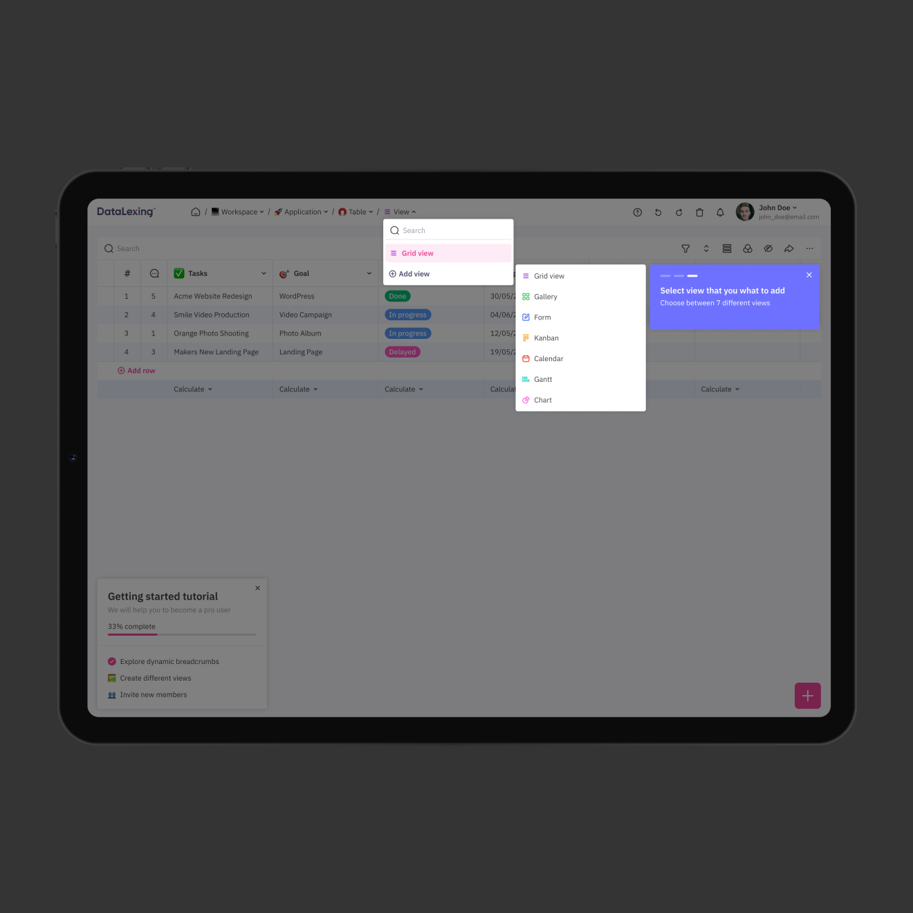
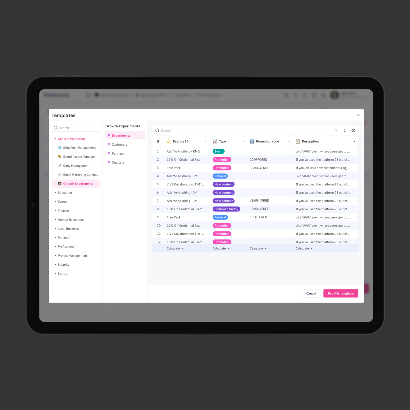
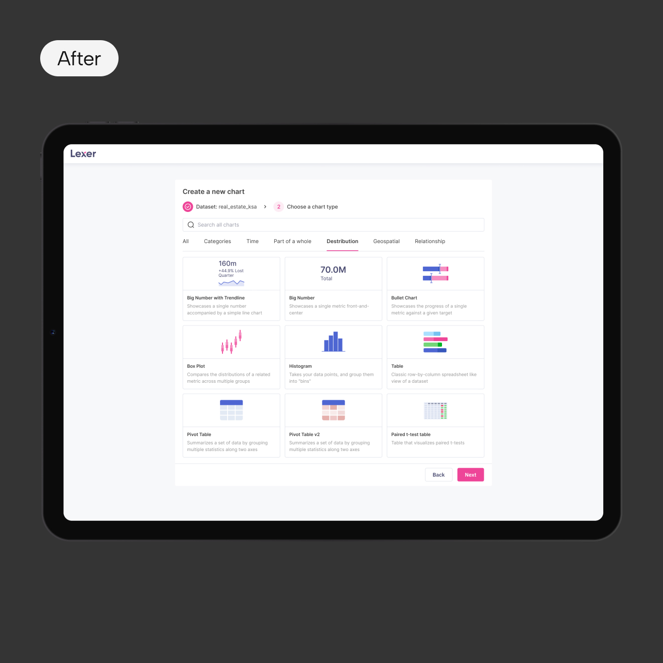
Unclear chart creation flow
Users were confused during the chart creation process. Charts were poorly grouped, visually unclear, and descriptions were long and only visible after selection
[ Task ]
Simplify the chart creation experience
Redesign the chart creation flow to make it intuitive, visually clear, and easy to navigate
[ Actions ]
Improved chart discoverability and clarity
- Replaced chart previews with simple, clean icons
- Added short descriptions under each chart type
- Grouped charts logically by category
- Simplified and shortened usage explanations
[ Result ]
Improved usability and workflow efficiency
- Reduced user confusion
- Improved discoverability of chart types
- Streamlined dashboard creation process
- Lowered cognitive load during data visualization

victoria29.vl@gmail.com
Datalexing
UX Research
REDESIGN
Personalization
Data Visualization
Mobile Optimization
[ About the project ]
Saudi-origin work operating system
DataLexing centralizes project management, data, and workflows into one intelligent platform. The platform is trusted by government and enterprise teams across 40+ countries and emphasizes high security, compliance, and seamless cross-team communication
[ Challenge ]
Work OS redesign
Redesign an existing platform to create an intuitive, seamless experience that consolidates project boards, data sheets, reports, and automation into one unified system, reducing complexity, supporting both technical and non-technical users, and meeting enterprise-level security and compliance standards
[ Challenge ]
Usability and design issues
Users found the platform difficult to navigate, it was visually inconsistent, and not aligned with modern design standards. Additionally, the platform required new features and better mobile responsiveness
[ Task ]
Enhance user experience
Redesign the product to improve usability, modernize the interface, introduce new features, and create a consistent cross-platform experience
[ Actions ]
Design and experience improvements
- Reworked information architecture to simplify navigation
- Updated components for a unified design system
- Improved interaction patterns for clarity and consistency
- Optimized layouts for mobile responsiveness
- Added new features
[ Result ]
Enhanced usability
- Improved usability and navigation clarity
- Delivered a scalable foundation for future features growth
[ Challenge ]
New users had difficulty getting started
The product lacked guidance, and users often abandoned key workflows early
[ Task ]
Design an onboarding experience
Design an onboarding experience that reduces friction, accelerates learning, and helps users quickly understand the platform’s value.
[ Actions ]
Added tutorials and in-app guidance
- Designed an interactive step-by-step tutorial
- Provided contextual guidance inside the interface
[ Result ]
Reduced confusion during first interaction
Faster user ‘aha moment’ discovery
[ Challenge ]
Lack of personalization
Users received the same generic experience regardless of their goals or interests, which reduced engagement and relevance
[ Task ]
Create a personalized experience
Create a personalized experience that adapts to user needs from the start
[ Actions ]
Onboarding questions and templates
- Introduced onboarding questions to identify user preferences
- Generated pre-made templates tailored to user goals
[ Result ]
Improved experience and engagement
- Increased relevance of initial experience
- Reduced setup time
- Improved user engagement
[ Challenge ]
Unclear chart creation flow
Users were confused during the chart creation process. Charts were poorly grouped, visually unclear, and descriptions were long and only visible after selection
[ Task ]
Simplify the chart creation experience
Redesign the chart creation flow to make it intuitive, visually clear, and easy to navigate
[ Actions ]
Improved chart discoverability and clarity
- Replaced chart previews with simple, clean icons
- Added short descriptions under each chart type
- Grouped charts logically by category
- Simplified and shortened usage explanations
[ Result ]
Improved usability and workflow efficiency
- Reduced user confusion
- Improved discoverability of chart types
- Streamlined dashboard creation process
- Lowered cognitive load during data visualization
